How to Choose the Right Fonts, Colors, and Graphics for Name Plates

How Companies Build a Professional Brand Image Through Quality Name Plates
30/10/2025
Industry-Specific Requirements for Metal Name Plates: What You Need to Know
13/11/2025How to Choose the Right Fonts, Colors, and Graphics for Name Plates
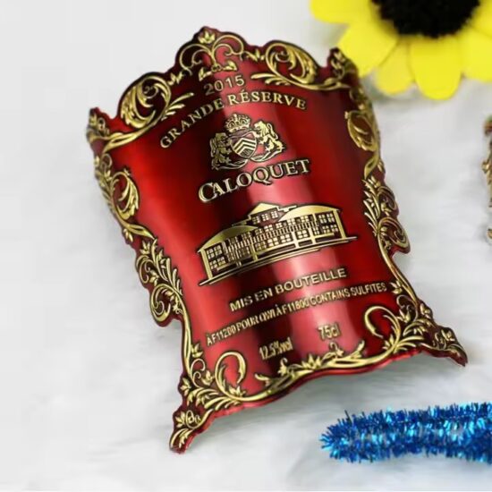
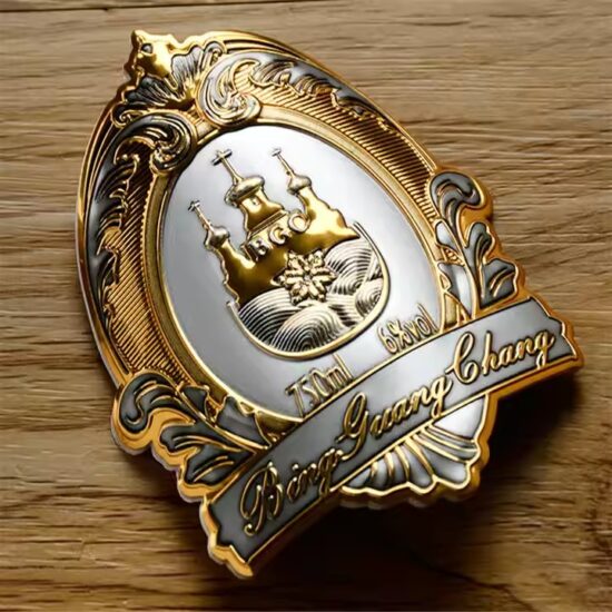
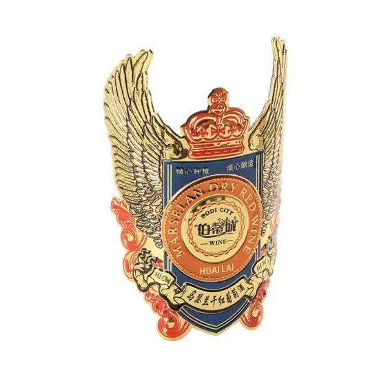
![]()
![]()
How to Choose the Right Fonts, Colors, and Graphics for Name Plates
Metal name plates are more than just identifiers—they’re key visual elements that represent a brand, deliver important information, and enhance a product’s professional appearance. The design choices you make—especially fonts, colors, and graphics—can significantly impact readability, aesthetics, and brand perception.
In this guide, we’ll walk you through how to choose the right fonts, colors, and graphic elements when designing metal name plates.
🔤 1. Font Selection: Balancing Style and Readability
The font (or typeface) you choose should reflect your brand while ensuring legibility in various environments.
✅ Considerations:
-
Readability is priority
Choose clear, simple fonts for technical or compliance plates. Avoid overly decorative fonts unless for branding purposes. -
Font categories
-
Sans-serif (e.g., Arial, Helvetica): Clean, modern, highly readable
-
Serif (e.g., Times New Roman): Formal, traditional, but less readable in small sizes
-
Script/Decorative: Elegant or artistic, best used sparingly for logos or headlines
-
-
Engraving compatibility
Fonts used for laser engraving or etching should have clean lines and avoid thin strokes, which may wear down or become illegible over time.
💡 Pro Tip:
Use bold versions for serial numbers or critical data, and uppercase text for labels or warnings to improve legibility.
🎨 2. Choosing Colors That Communicate Clearly
While metal plates tend to use natural finishes like brushed silver, stainless steel, or anodized aluminum, color is still a valuable design tool—especially in printed or anodized plates.
✅ Color Tips:
-
High contrast = high readability
Use dark fonts on light backgrounds (e.g., black on silver) or vice versa (e.g., white on black anodized aluminum). -
Brand alignment
Choose colors that align with your corporate color palette for consistent branding. For example, red and black for industrial toughness; gold and navy for elegance. -
Environmental considerations
If the plate is used outdoors, choose UV-stable and fade-resistant inks or anodized colors. -
Compliance or warning colors
Use red for warnings, green for safety, or yellow for caution as per ISO and ANSI standards.
🖼️ 3. Using Graphics Effectively
Graphics can add both functionality and branding to your name plate design—but only if used strategically.
✅ Best Practices:
-
Logo placement
Include your company logo on the plate for brand recognition. Use vector format for sharp detail in printing or engraving. -
Icons and symbols
Use standard safety symbols or equipment indicators to help with fast identification. -
Borders and lines
Clean lines or subtle frames help separate sections or highlight key data without making the design too busy. -
QR codes / barcodes
Useful for traceability, product registration, or inventory. Ensure they are etched or printed with enough clarity to remain scannable.
💡 Pro Tip:
Avoid clutter. A minimal design with strategic graphics often looks more premium and is easier to read.
📏 4. Design Layout: Keeping It Balanced
Once you’ve chosen your fonts, colors, and graphics, focus on layout. A well-balanced name plate design:
-
Uses hierarchy (larger font for titles, smaller for details)
-
Keeps consistent spacing between elements
-
Aligns text and graphics cleanly—left, center, or justified
-
Leaves enough margin or white space around the edges
🏁 Conclusion
The right combination of fonts, colors, and graphics can turn a simple metal name plate into a powerful branding and functional asset. By focusing on legibility, brand consistency, and clean design, you can ensure your name plates make a strong impression—both visually and professionally.
Whether you’re labeling machinery, showcasing a luxury product, or enhancing your brand image, thoughtful design choices speak volumes.
